
Data storytelling in reports is the deliberate combination of checkable data, a visual that makes the key pattern obvious, and a short narrative that converts that pattern into a specific decision, following a Context, Turn, Ask sequence. The payoff is a report that gets acted on instead of skimmed and filed. This guide covers the frameworks, visual rules, and a step-by-step workflow, plus a copy-paste checklist, so your next report earns a decision instead of a shrug.
TL;DR:
- Clear data storytelling requires one main insight, a specific recommendation with an owner and deadline, and supporting visuals with plain captions.
- Visualizations must match the data type, use preattentive attributes intentionally, and include standalone captions to build trust and clarity.
- Structuring reports around a threaded narrative with a strong context, a surprising turn, and a precise ask significantly improves decision-making engagement.
- Writing the Ask upfront and storyboarding before charting ensures the final report is focused, logical, and reduces rework.
- Using tools like Gleanit can streamline data consolidation and report drafting, saving time and enabling more effective client-focused marketing reports.
Table of Contents
- What Is Data Storytelling and Why Does It Matter in Reports?
- What Are the Core Elements of a Data Story?
- Which Framework Should You Use to Structure a Report?
- How Do You Design Charts People Actually Trust?
- How Do You Build a Decision-Ready Report Step by Step?
- How Should a Report Be Laid Out for Different Readers?
- What Should a Report Checklist and Template Look Like?
- What Do Good Data Stories Look Like in Marketing Reports?
- How Gleanit Helps You Produce Action-Oriented Marketing Reports
- Three Habits That Separate Good Data Storytellers From Everyone Else
- Get Decision-Ready Reports Without the Manual Data-Wrangling
- Sources
What Is Data Storytelling and Why Does It Matter in Reports?
Data storytelling means pairing evidence with a narrative sturdy enough to carry a reader to a decision. It’s not decoration on top of a dashboard. It’s the difference between “here’s what happened” and “here’s what you should do about it.” HBS Online frames it as pairing analysis with persuasive narrative, where framing and a clear call to action are what make the story land.
The benefits show up fast once you see them: stakeholders grasp the point in one pass instead of five, recommendations stop sounding vague, and teams stop arguing about what the numbers mean because the report already answered that question.
Most reports fail for two boring reasons.
- Charts get dropped in with no context, so the reader has to reconstruct the “so what” themselves.
- Dashboards describe the past but never conclude anything, leaving the recommendation as an exercise for the reader.
Both failures are fixable with structure, not more data.
What Are the Core Elements of a Data Story?
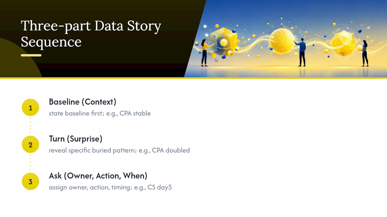
A report that actually tells a data story contains five ingredients, in this order:
- Context. A shared baseline the reader already trusts, so the new information has something to push against.
- Turn. One insight that breaks the baseline, stated as a single sentence. Not three insights. One.
- Ask. A specific recommendation, with an owner and a timeframe attached.
- Data provenance and confidence notes. Where the numbers came from, what date range they cover, and how confident you actually are.
- A Big Idea chart plus supporting visuals. One chart carries the main claim; the rest back it up, each with a caption that states the point in plain words.
Skip any of these and the report drifts back into being a data dump with a title slide. The Data Story Spine framework, built around Context, Turn, and Ask, exists specifically because that three-part shape is what separates a narrative from a chart collection.
Which Framework Should You Use to Structure a Report?
Two frameworks do almost all the work here, and they’re really the same idea at different zoom levels.
The Data Story Spine operates at the sentence level: write “Here’s the situation. Here’s what changed. Here’s what we should do” before you touch a chart tool. The three-act structure operates at the document level: act one becomes your executive summary, act two becomes the evidence section, act three becomes implications and next steps.
- Draft the Context, Turn, and Ask sentences in plain text before designing a single chart.
- Map act one to the summary, act two to supporting evidence, act three to the recommendation and its consequences.
- Decide upfront whether this is a one-off report or a living story that updates on a cadence, since living stories need a stable template you can refresh weekly without rebuilding the narrative each time.
Pro Tip: Write the Ask sentence before you write anything else. If you can’t state what you want the reader to do in one sentence, you don’t have a story yet. You have a topic.
How Do You Design Charts People Actually Trust?
Chart choice starts with the question, not the data set. Comparisons want bar charts. Trends over time want lines. Distributions want histograms or box plots. Composition wants stacked bars or, sparingly, a pie chart when there are genuinely few categories.
Color needs the same discipline. Match the palette to the data type: qualitative palettes for categorical groups, sequential palettes for ordered numeric data, and diverging palettes for values that sit on either side of a meaningful midpoint, like a target or zero.
Preattentive attributes, meaning color, size, and position, are what let a reader’s eye find the point before their brain has consciously read a single label. Use them on purpose:
- Gray out everything except the one data series that matters, then let a single accent color carry the reader’s eye straight to it.
- Label the point on the chart itself instead of forcing a legend lookup.
- Give every chart a standalone caption that states the takeaway in words, not just a title naming the metric.
Research on visual perception published in SAGE found that effective visualizations guide attention toward patterns rather than individual data points, and that poor chart design slows perception and erodes trust, especially among viewers with lower graph literacy.
That’s not an aesthetic nitpick. A chart a reader has to decode loses their confidence in the number before they’ve even reached your Ask.
How Do You Build a Decision-Ready Report Step by Step?
- Write the story abstract first. One paragraph: what happened, why it matters, what to do. This is your compass for every chart you build afterward.
- Storyboard before you chart. Sketch each planned slide or section on a sticky note (physical or digital) with its Big Idea written above it. If a chart doesn’t earn a sticky note, it doesn’t earn a place in the report.
- Draft the executive summary before the body. Writing it last tempts you to just summarize whatever you happened to build. Writing it first forces every later chart to serve that summary.
- Sequence supporting evidence to back the Turn, not to show off analysis. Three to five charts, each captioned with its own one-line takeaway, usually beats ten uncaptioned ones.
- Make the Ask specific. Name an owner and a timeframe. “Consider optimizing the funnel” is not an ask. “Reallocate 15% of top-of-funnel spend to retargeting by the next budget cycle” is.
Pro Tip: Storyboarding first, as narrative sequencing research on data visualization points out, cuts down on rework because you catch a weak or missing insight before you’ve sunk hours into a chart nobody needed.
How Should a Report Be Laid Out for Different Readers?
Not every reader needs the same depth, and pretending otherwise is why 40-page reports get read by nobody past page two. The fix is progressive disclosure: overview first, then zoom, then details on demand for the reader who wants to dig.
- The executive summary carries the Big Idea, the Turn, and the Ask, nothing else, in three to five sentences.
- The body carries the evidence: your three to five supporting charts, each with its caption and a short paragraph of interpretation.
- The appendix carries methodology, raw tables, data provenance notes, and anything a skeptical reader might ask for but a busy executive never will.
Format changes the execution but not the logic. A printed report leans on that appendix structure directly. A slide deck compresses the executive summary into a title slide and lets each subsequent slide serve as one evidence chart. An interactive report, built through something like a unified marketing dashboard, can let the reader filter and zoom live, but it still needs a default view that states the Big Idea before anyone touches a filter.
What Should a Report Checklist and Template Look Like?
Before you hit send, verify these five things:
- Every data source and date range is stated somewhere in the report.
- Outliers are either explained or flagged as unexplained, never silently smoothed over.
- Every claim in the executive summary could survive a skeptical reader asking “how do you know that?”
- The Ask names an owner and a timeframe.
- Charts and captions have been reviewed by someone who wasn’t in the room when the analysis was built.
A reusable template keeps this consistent report after report:
- Big Idea: one sentence.
- Executive summary: three to five sentences covering Context, Turn, and Ask.
- Evidence section: three to five charts, each with a caption.
- Ask: two to four bullets, each with an owner and a deadline.
- Appendix: methodology, raw data, provenance notes.
The ethical rule underneath all of it is simple: if you can’t defend every claim to a skeptical reader, cut the claim, not the reader’s skepticism.
What Do Good Data Stories Look Like in Marketing Reports?
Campaign performance report. Context: last quarter’s cost per acquisition held steady across channels. Turn: one channel’s CPA quietly doubled while spend stayed flat, a pattern invisible in the aggregate number. Ask: pause that channel’s current creative rotation and run a creative testing framework before reallocating budget.
Churn analysis report. Context: monthly churn has tracked around a stable baseline for a year. Turn: churn spiked specifically among customers who never completed onboarding within the first seven days, a detail the overall churn number buried. Ask: add a mandatory onboarding check-in at day five, owned by customer success, starting next month.
What to copy from both: the Turn is always one sentence, the baseline is always stated before the surprise, and the Ask always names who does what and by when. Strip those three things out and you’re left with a status update, not a story.
How Gleanit Helps You Produce Action-Oriented Marketing Reports
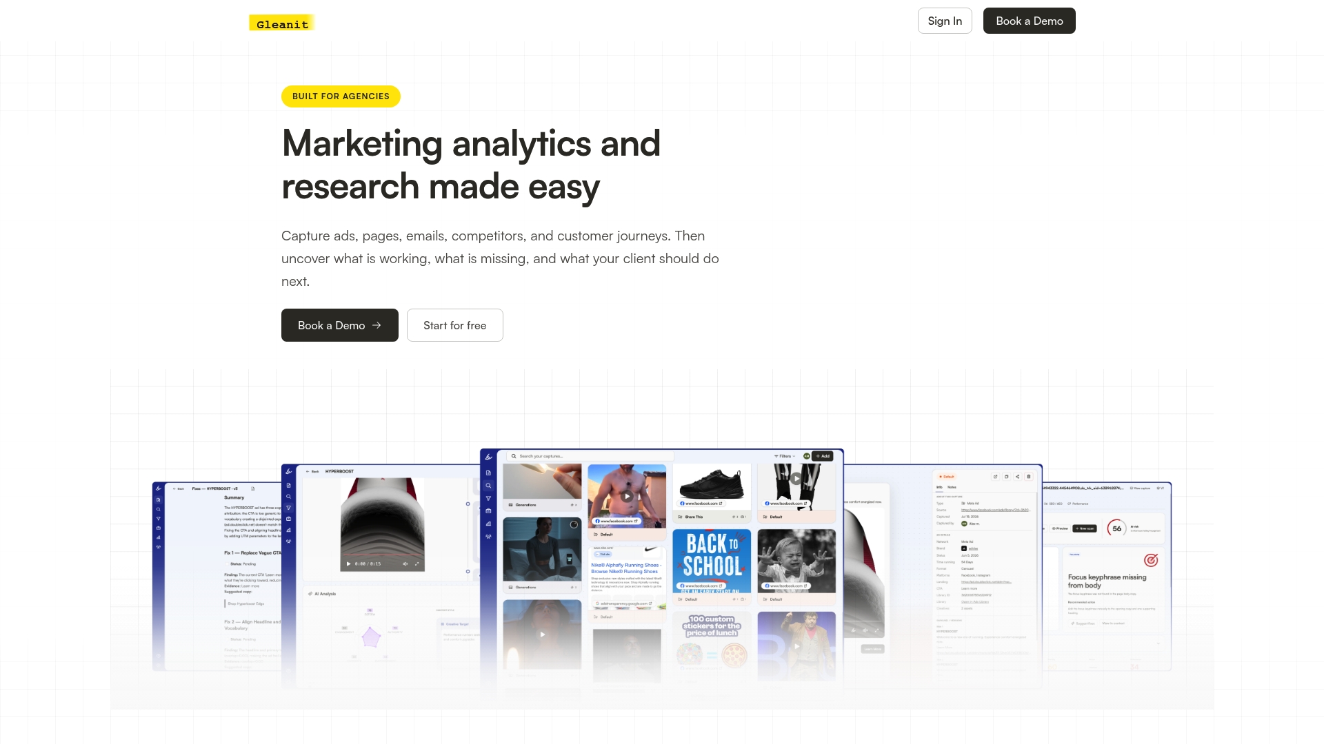
Building the report described above gets a lot faster when you’re not stitching together exports from four different ad platforms by hand. Gleanit pulls monitoring data from Meta, TikTok, Google, and LinkedIn into one connected view, so the Context section of your report starts from a baseline that’s already reconciled across channels instead of four spreadsheets that don’t quite agree.
That consolidated view is also where the Turn tends to surface. Gleanit’s funnel gap diagnostics flag where a customer journey breaks down and rank fixes by likely ROI, which gives you a candidate insight to build the story around instead of hunting for one manually.
- AI-assisted report drafting speeds up turning raw findings into an initial executive summary and supporting narrative.
- Frequent feature updates help keep the reporting workflow adapting rather than going stale between periodic reviews.
- Client-dedicated workspaces keep the customer journey analytics behind each report organized by account.
Three Habits That Separate Good Data Storytellers From Everyone Else
Write the Big Idea sentence before you open a charting tool. Test it on the most skeptical person on your team, not the most agreeable one. If it survives that, your charts have a job to do; if it doesn’t, you just saved yourself a week of building visuals for a claim that doesn’t hold up.
Keep every visual single-minded. One chart, one point. And treat your reports as living stories you iterate on weekly, not monuments you build once and defend forever.
— Ovannes
Get Decision-Ready Reports Without the Manual Data-Wrangling
Building the reports this guide describes takes real time when you’re pulling data from Meta, TikTok, Google, and LinkedIn by hand and reconciling it before you can even write the Context sentence. Gleanit is built specifically for that gap: it consolidates cross-channel ad and customer journey data into one workspace, flags the funnel breaks worth writing a Turn about, and uses AI to help draft the report narrative itself.
For agencies managing several client accounts, that means less time formatting spreadsheets and more time on the Ask that actually moves a client’s budget. If your team also needs outside market comparators when framing a report’s Context, a resource like US Market Intelligence can help round out the baseline.
If you’re ready to see how it handles your own client data, start a free trial on Gleanit and build your next report from a single connected view instead of four browser tabs.
Sources
- Research on visual communication and perception (SAGE)
- Designing effective data visualizations — Johns Hopkins University guide
- Data Storytelling: How to Effectively Tell a Story with Data — HBS Online
- What Is Data Storytelling? The Complete Guide (Storyflow)
Recommended
- Unified Marketing Dashboard: Faster Insights for Agencies
- Customer Journey Analytics: A Practical Guide for Marketing Teams
- Cross-Channel Attribution: A Practical Playbook for Analysts
- Campaign Post Mortem: A Repeatable Agency Template
Corrections: ovannes@hearye.co or our editorial policy.