
If your numbers are worse than that, don’t panic yet: the right move is comparing your account to your specific industry’s percentile bands, not to a blended cross-industry average that mixes retail with SaaS with local services.
TL;DR:
- Comparing your ad account to industry-specific percentile bands offers a more accurate performance assessment than using blended cross-industry averages.
- Rising CPMs, now around $15.06 on average, combined with improved CTRs, means reach costs more but ads are working harder, especially in competitive Q4 periods.
- Industry variations show ecommerce and beauty tend to have higher CTRs and lower CPAs due to impulsive purchases, while finance and SaaS lag with higher costs and longer sales cycles.
- Campaign objectives and placements significantly influence metrics, with conversions campaigns generally delivering better ROI despite higher costs, and mobile ads outperform desktop on CTR.
- Proper measurement setup, including Conversions API and cohort analysis, is crucial; without accurate tracking, performance data can mislead even well-optimized campaigns.
Table of Contents
- Facebook Ads Benchmarks 2026: The Quick Hits
- Platform-Level Medians and Percentile Bands
- Facebook Ads Benchmarks by Industry
- Metrics by Campaign Objective and Placement
- How to Read Benchmarks Without Fooling Yourself
- Where This Benchmark Data Comes From
- What Changed in 2025 and 2026
- A One-Week Checklist to Act on These Numbers
- Benchmarks Across Age, Gender, and Location
- How Budget Size Changes Your Numbers
- Mobile vs. Desktop Performance
- Benchmarks by Ad Format
- Common Pitfalls in Reading Benchmark Data
- Using Benchmarks Inside an Agency Workflow
- The Real Value of a Benchmark Isn’t the Number
- Track Benchmark Drift Without Building the Spreadsheet Yourself
- Sources
Facebook Ads Benchmarks 2026: The Quick Hits
Before you dig into industry tables and placement breakdowns, here’s what actually moves the needle this year.
- Platform median CTR: roughly 2.39%, with managed-account data putting Q1 2026 CTR closer to 1.72%, depending on account mix and campaign type.
- Platform median CPM: around $15.06, up year over year, with a reliable Q4 spike driven by holiday competition for the same inventory.
- Platform median CPA: approximately $38.99 across a broad sample, though verticals with long sales cycles or high average order values will run higher without that being a red flag.
- Platform median CVR: near 1.53%, a number that swings hard depending on whether the campaign optimizes for purchase, lead, or landing page view.
The biggest recent shift isn’t any single metric. It’s that CPMs have climbed while CTRs have also improved, which means reach costs more but the ads people do see are working harder. That combination changes how you should read a benchmark: a flat or declining CPA despite rising CPM usually signals your creative and targeting are compensating well.
Before comparing your account to any of this, run three checks: confirm you’re looking at a sample window of at least 200 to 300 conversions, verify your conversion tracking (Pixel and Conversions API) is firing consistently, and rule out creative fatigue by checking frequency and days-in-market on your top spenders. Skipping these checks is the fastest way to misread a benchmark.
Platform-Level Medians and Percentile Bands
Averages lie. A handful of huge accounts spending seven figures a month can drag a “cross-industry average” CPM up or down in ways that have nothing to do with your $2,000/month campaign. That’s why the more useful framing splits results into percentile bands: P25 (bottom quartile), median, P75 (top quartile), and an “elite” tier above that.
Here’s how the core metrics stack up using the platform medians reported by Triple Whale and RedClaw, cross-checked against the percentile methodology from Benchmarketing:
A quick refresher on how these are calculated, since sloppy definitions are the number one reason benchmark comparisons go wrong:
- CTR (click-through rate): clicks divided by impressions, expressed as a percentage. Link clicks and all clicks give different numbers, so confirm which one a benchmark source uses.
- CPC (cost per click): total spend divided by clicks. Sensitive to bidding strategy and audience competition.
- CPM (cost per thousand impressions): total spend divided by impressions, multiplied by 1,000. This is the purest measure of auction competitiveness.
- CVR (conversion rate): conversions divided by clicks (or link clicks, depending on the source). Watch for whether it’s calculated on all traffic or only on landing page visitors.
- CPA (cost per acquisition): total spend divided by conversions. The metric most sensitive to attribution window changes.
- ROAS (return on ad spend): revenue attributed to ads divided by ad spend.
One number worth sitting with: median CPM has climbed to around $15.06, which means the same $1,000 daily budget now buys roughly 66,000 impressions instead of the 75,000+ it might have bought a couple of years back. If your reach numbers feel like they’re shrinking even though budget hasn’t changed, this is why.
That gap is the entire argument for using bands instead of a single benchmark figure.
Facebook Ads Benchmarks by Industry
Vertical matters more than almost any other variable when you’re judging whether a number is good.
CTR by industry
CPM by industry
| Industry | P25 | Median | P75 |
|---|---|---|---|
| Ecommerce / retail | around $19.00 | about $14.50 | roughly $10.50 |
| Beauty & personal care | about $17.50 | near $13.80 | nearly $9.90 |
| Health & wellness | about $18.20 | near $14.90 | about $10.80 |
| Finance & insurance | around $24.00 | about $19.50 | nearly $14.00 |
| SaaS / B2B | about $22.50 | near $18.20 | around $13.50 |
| Local services | about $16.00 | approximately $12.40 | near $8.90 |
CPA and ROAS by industry
Ecommerce and beauty brands tend to post stronger CTR and CVR because the purchase decision is impulsive and low-commitment. Finance and SaaS lag on CTR and CPA because the buyer intent is higher-stakes and the sales cycle stretches out, often past the ad platform’s attribution window entirely. Local services land in the middle: intent is high (someone actively needs a plumber or dentist), but the addressable audience per geography is small, which keeps CPMs from dropping too far.
None of these numbers replace the P25/median/P75 method from the section above. Use the industry table to pick the right lane, then use percentile bands within that lane to judge whether you’re actually performing well or just riding a favorable niche.
Metrics by Campaign Objective and Placement
Objective selection changes almost every metric in predictable ways, and that predictability is useful. Awareness campaigns are optimized for cheap reach, so CPM drops but CTR and CVR tell you almost nothing about buying intent. Conversions campaigns cost more per click because Meta’s algorithm is filtering for people likely to complete the action you asked for.
- Awareness: lowest CPM, lowest CTR, not meant to drive clicks or sales directly.
- Traffic: moderate CPM, higher CTR than awareness, but conversion quality on landing pages is often weak because the algorithm optimizes for clicks, not buyers.
- Lead generation: CPC often lower than conversions campaigns, but lead quality varies widely depending on form friction and instant-form settings.
- Conversions: highest CPC and CPM of the standard objectives, but the best CVR and, usually, the best CPA once the pixel has enough data to optimize.
- Retargeting: the cheapest CPA of any segment, since the audience already knows the brand, but volume is capped by how many people you can put into the warm audience in the first place.
Placement changes the math again:
| Placement | Relative CPM | Relative CTR | Notes |
|---|---|---|---|
| Feed | Baseline | Baseline | Most balanced and predictable |
| Stories | Lower | Lower | Cheap reach, weaker intent signals |
| Reels | Moderate | Higher | Strong for video-first creative, per Benchmarketing placement data |
| Marketplace | Lower | Moderate | Good for local and ecommerce, less so for lead gen |
| Right column | Lowest | Lowest | Cheap volume, rarely worth optimizing for alone |
Favor the conversions objective even when CPC runs higher, as long as your CPA and ROAS come in ahead of your industry median. A traffic campaign that posts a lower CPC but sends people who never buy is more expensive in the way that actually counts.
How to Read Benchmarks Without Fooling Yourself
A single average number tells you almost nothing actionable. The 4-band method fixes that by giving you four reference points instead of one:
- P25 marks underperformance. If you’re here, something structural is likely broken: bad targeting, weak creative, or a landing page that doesn’t match ad intent.
- Median is the center of the distribution. Landing here means you’re doing nothing wrong, but nothing exceptional either.
- P75 represents strong, replicable performance. This is a realistic short-term goal for most accounts with decent creative and clean tracking.
- Elite (top 5 to 10%) usually reflects a specific advantage, like a proprietary audience, exceptional brand recognition, or a product with viral creative potential that’s hard to copy on demand.
Turning a raw ROAS benchmark into a target that actually protects your margin takes one more step.
Three practical moves before you trust any comparison: cohort your data by campaign objective and date range so you’re not blending awareness with conversions campaigns; confirm your Conversions API is capturing events that the Pixel alone misses; and set experiment-specific KPIs before you launch, not after you see results.
Pro Tip: Don’t chase the elite band on every metric at once. Pick the one metric most tied to your revenue (usually CPA or ROAS) and aim for P75 there first. Chasing top-tier CTR while ignoring CPA is a common way to burn budget on clicks that never convert.
Where This Benchmark Data Comes From
Benchmark numbers are only as trustworthy as the accounts behind them, and most reports pull from different populations with different quirks.
- Triple Whale’s dataset covers a large sample of ecommerce and DTC brands from August 2025 through July 2026, which is why its medians lean slightly toward retail-style performance.
- RedClaw’s Q1 2026 figures come from managed agency accounts, a population that tends to run tighter tracking and more disciplined budgets than the average self-serve advertiser.
- Benchmarketing’s percentile data breaks results out by placement, which is useful for isolating Feed versus Reels versus Stories performance.
- WordStream’s cross-industry averages are widely cited but blend all industries and account sizes into single averages, which is exactly the pattern the percentile-band method is designed to correct for.
Two measurement biases show up constantly: accounts on Pixel-only tracking under-report conversions compared to those running Conversions API, and aggregated averages get skewed by a small number of huge spenders. Don’t trust any comparison built on fewer than 200 conversions or a window shorter than two to three weeks.
What Changed in 2025 and 2026
CPM climbed across nearly every industry through 2025 and into 2026, with a reliable Q4 spike as retailers pile into the same holiday inventory. At the same time, CTR improved, largely thanks to better creative testing habits and wider adoption of Advantage+ automated delivery, which routes budget toward the placements and audiences most likely to click.
That combination, more expensive reach paired with better engagement, means CPA has stayed roughly stable for well-run accounts even as CPM rose. It also means post-click conversion quality matters more than it used to, since a costlier click that doesn’t convert hurts more than it did a couple of years ago.
The other major shift is measurement infrastructure, with important differences in tracking systems outlined in Kuo skiriasi „Google Analytics“ ir „Facebook“ skelbimų stebėjimas? | Admoon. Accounts that adopted Conversions API alongside the Pixel report meaningfully higher ROAS and fewer missing conversions than Pixel-only setups. That’s not because their campaigns are secretly better. It’s because they’re capturing events the browser-based Pixel loses to ad blockers, iOS privacy settings, and cookie restrictions. If your account looks worse than benchmark on ROAS specifically, check your server-side tracking before you touch creative.
A One-Week Checklist to Act on These Numbers
Segment your account by campaign objective and date range first, so you’re comparing conversions campaigns to conversions benchmarks and not blending in awareness spend that was never meant to convert.
- Creative A/B test (14 to 21 days): Run two creative concepts against the same audience and budget. Track CTR lift first, then downstream CVR. If CTR improves but CPA doesn’t move, the problem is likely on the landing page, not the ad.
- Placement reallocation (7 to 10 days): Shift 20 to 30% of budget from Feed into Reels or Stories and watch CPM and CTR shift. This works especially well for video-first creative.
- Post-click conversion lift (2 to 3 weeks): Test a simplified checkout or lead form against your current one, holding ad spend and targeting constant. This isolates how much of your CPA problem is upstream (ads) versus downstream (site).
Success looks like closing the gap toward your industry’s P75 band on at least one metric per test cycle, not chasing every band at once.
Pro Tip: Run only one experiment per campaign objective at a time. Stacking a creative test and a landing page test simultaneously makes it impossible to tell which change actually moved the needle. A structured creative testing framework helps keep these experiments from colliding.
Benchmarks Across Age, Gender, and Location
Demographic performance splits are some of the most misread numbers in Meta reporting, mostly because marketers assume a demographic with a lower CTR is a demographic to cut, when it’s often just a demographic with a different buying rhythm.
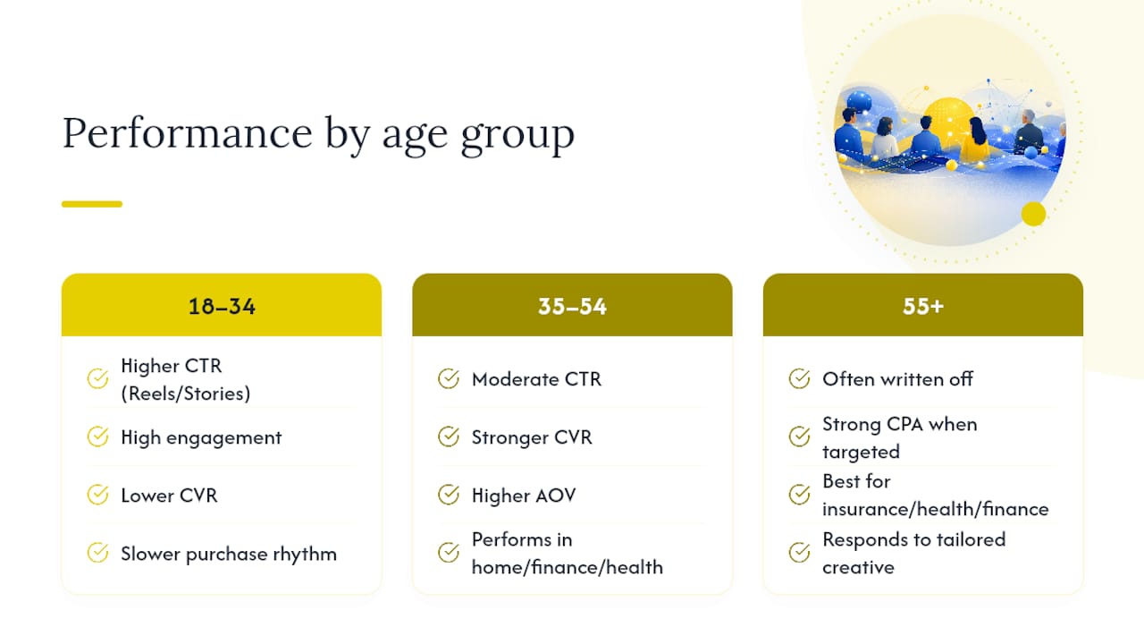
Younger audiences, roughly 18 to 34, tend to post higher CTR and engagement on Reels and Stories placements, but their CVR often lags behind older cohorts because the purchase decision takes longer or the disposable income is lower. Audiences 35 to 54 typically show more moderate CTR but stronger CVR and higher average order values, especially in categories like home goods, financial services, and health products. The 55-plus segment frequently gets written off, but for categories like insurance, healthcare, and certain financial products, this group often delivers the strongest CPA once the creative speaks to their actual concerns instead of recycling younger-skewing messaging.
Gender splits vary heavily by category rather than following a universal pattern. Beauty and apparel often skew female in CTR, while categories like B2B software, financial trading tools, and certain home improvement services skew male. Neither pattern holds for every account.
Location matters most through cost of living and local competition. Major metro areas post higher CPMs due to advertiser density, but often deliver stronger CVR because of higher average incomes. Rural and smaller markets can look cheap on CPM while quietly underperforming on volume simply because the addressable audience is small.
How Budget Size Changes Your Numbers
Small budgets (under roughly $1,000 to $2,000 a month) tend to see noisier metrics because the algorithm hasn’t accumulated enough conversion data to optimize delivery efficiently. This is often mistaken for poor performance when it’s really a data problem: Meta’s ad delivery system needs a reasonable volume of conversion events, typically at least a few dozen per week, to exit the learning phase and stabilize.
Mid-size budgets ($2,000 to $20,000 a month) usually see the most stable, benchmark-aligned numbers, since there’s enough data for efficient optimization without so much spend that the account exhausts its highest-intent audience segments.
Large budgets (above $20,000 a month) often show a split pattern: strong median performance across the account, but a wider gap between top and bottom campaigns because bigger budgets force expansion into lower-intent audience segments to maintain delivery volume. This is normal and doesn’t necessarily mean inefficiency. It means averaging across a large account hides real variation between your best and worst campaigns, which is exactly the kind of thing a percentile-based internal benchmark, not just an external one, is built to catch.
Mobile vs. Desktop Performance
Mobile dominates Facebook ad delivery by volume, typically accounting for the large majority of impressions across most account types. Mobile CTR tends to run higher than desktop, partly because of thumb-stopping Reels and Stories inventory that barely exists on desktop, and partly because mobile users browse in shorter, more frequent sessions that favor snackable content.
Desktop, despite lower volume, often shows stronger CVR for higher-consideration purchases like B2B software, larger ecommerce orders, or anything involving a multi-step checkout or account creation. People are more likely to complete a complex form or enter payment details on a full keyboard and larger screen than while scrolling on a phone during a commute.
The practical implication: don’t judge a campaign purely on blended CTR without checking the device split first. A campaign that looks mediocre overall might be excellent on mobile and mediocre on desktop, or the reverse, and lumping them together hides the fix. If checkout friction is the real problem, a device-level cut of your data will usually surface it faster than a creative change will.
Benchmarks by Ad Format
Single-image ads remain the most consistent baseline performer: predictable CTR, lower production cost, and the easiest format to test quickly. They rarely deliver the highest CTR in an account, but they’re the cheapest lever to pull when you need a fast comparison point.
Video ads, especially short-form video built for Reels, tend to post the highest CTR of the standard formats, often meaningfully above single image, because motion and sound capture attention in a scrolling feed better than a static frame. The tradeoff is production cost and a shorter shelf life. Video creative fatigues faster than a strong static image, so refresh cadence matters more here than with any other format.
Carousel ads sit in between: strong for ecommerce and multi-product catalogs because they let a single ad showcase several items, which tends to lift CTR for shoppers still comparing options, but they underperform single image or video for straightforward, one-product offers where added complexity doesn’t add value. If you’re running a single hero product, a strong image or video will usually outperform a carousel built to pad out extra slides.
Common Pitfalls in Reading Benchmark Data
The most common mistake is comparing your account to a cross-industry average instead of your own vertical’s percentile band, which makes a genuinely solid SaaS campaign look like a failure next to ecommerce’s naturally higher CTR.
The second mistake is ignoring attribution window mismatches. A benchmark built on a 7-day click window will show a different CPA and ROAS than the same account measured on a 1-day view window, and comparing across mismatched windows produces conclusions that have nothing to do with actual performance.
A third pitfall is treating a small sample as statistically meaningful. A campaign with 40 conversions over three days can swing wildly week to week, and reading a single good or bad day against an annual benchmark median is close to meaningless.
Finally, marketers frequently forget that benchmarks blend campaign objectives. Comparing a retargeting campaign’s excellent CPA against a broad benchmark median (which mixes awareness, traffic, and conversions campaigns together) will always make retargeting look artificially strong and cold prospecting look artificially weak, when the real comparison should happen within objective, not across all objectives at once.
Using Benchmarks Inside an Agency Workflow
Agencies that operationalize benchmarks well don’t just glance at a number once a month. They build percentile bands into recurring reporting and compare each client’s cohort, split by objective, placement, and date range, against both the client’s own historical baseline and the relevant industry band.
Automated monitoring tools built for this, Gleanit among them, watch for that kind of drift across Meta, TikTok, and Google simultaneously, and flag where a funnel gap, not the ad itself, is quietly eating into performance. That distinction changes what you fix first: a rising CPA caused by a broken landing page needs a different response than one caused by genuine ad fatigue.
The Real Value of a Benchmark Isn’t the Number
Most marketers treat benchmarks like a report card: hit the number, feel good, miss it, panic. That instinct misses the actual point. A benchmark’s job is to tell you whether a problem is structural or situational, and most accounts never ask that question before reacting.
Here’s where conventional advice falls short: it treats “compare to industry average” as good enough guidance, when the real gap between P25 and P75 performance in almost every metric above is wide enough to bankrupt one campaign and fund another. Averages hide that spread. Percentile bands expose it.
If there’s one thing worth prioritizing over everything else in this data, it’s fixing measurement before touching creative. A CPA that looks weak because Conversions API isn’t capturing half your conversions will never improve no matter how many ad variations you test. Get the data foundation right first, then use the bands to decide what’s actually worth optimizing next.
— Ovannes
Track Benchmark Drift Without Building the Spreadsheet Yourself
Running these comparisons by hand, cohorting by objective, pulling percentile data, checking placement splits, catching CPA creep before it snowballs, eats hours every week that could go toward strategy instead. Gleanit is built for agencies and marketing teams that need that comparison running in the background, not as a monthly fire drill.
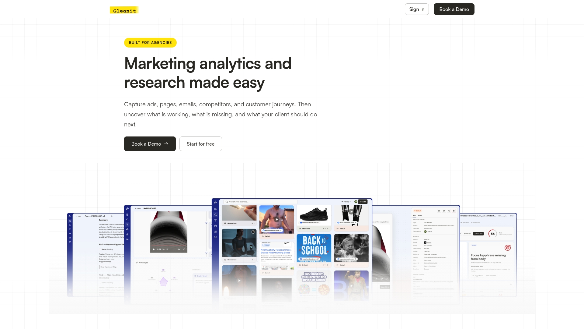
The platform automates ad monitoring across major channels, so drift in CTR, CPA, or ROAS surfaces before a client asks about it. It tracks customer journeys end to end, flags funnel gaps between the ad and the conversion, and prioritizes fixes by likely impact instead of leaving you to guess which metric matters most this week. Reports and cross-channel views live in one workspace built for agencies managing several clients at once, with reporting assistance that turns raw benchmark comparisons into client-ready reports.
If your team is still comparing benchmarks manually, start a Gleanit trial and see how much of this reporting can run itself.
Sources
- Facebook Ad Benchmarks by Industry (Updated 2026 Data) | Triple Whale
- Meta Ads Benchmarks 2026: CTR, CPC, CPA & ROAS by Industry (Real Data) | RedClaw
Recommended
- Google Ads Benchmarks 2026: CTR, CPC, CVR by Industry
- TikTok Ads Benchmarks for US Marketers in 2026
- A Creative Testing Framework That Actually Scales Ad Results
- The LinkedIn Ad Library Guide Every Marketer Needs
Corrections: ovannes@hearye.co or our editorial policy.