
The fastest way to get Figma-ready client reports out the door is an agentic automation pipeline. It pulls data from ad platforms, drafts the narrative, and exports slides, PDFs, or design-native assets without a designer touching raw numbers. Some platforms run this kind of pipeline end to end, which typically hands account teams back several hours per client each month while producing sharper, prioritized commentary than a manually built deck ever does.
TL;DR:
- Connectors must support multiple ad platforms like LinkedIn and TikTok to avoid manual data merging, especially as client account diversity grows.
- Building a KPI dictionary before template mapping prevents metric definition errors that require costly corrections across multiple reports.
- Exporting reports as PDFs or SVGs allows for editable visuals or direct embedding into Figma, maintaining brand consistency with design tokens.
- Implementing schema-locking, anomaly detection, and audit trails in the governance layer reduces review time to under an hour per client, increasing report accuracy.
- Automation becomes cost-effective once a firm manages more than 12 to 15 clients, with setup effort rarely offset for smaller agencies with fewer accounts.
Table of Contents
- What Is Figma for Marketing Reports, Really?
- How Does Automated Reporting Architecture Work?
- How Do You Set Up Connectors and Templates the Right Way?
- How Do You Export Automated Reports into Figma?
- How Does Governance Keep AI Reports Accurate?
- When Does Report Automation Actually Pay Back?
- What Does a 90-Day Rollout Look Like?
- Best Practices for Designing Clear, Persuasive Report Visuals
- Step-by-Step: Building a Report from Raw Data to Final Layout
- How Do Teams Collaborate on Reports Before Delivery?
- How Do You Keep Branding Consistent Across Every Report?
- What Goes Wrong When You Connect Data Sources to Design Files?
- Treat Reporting as Infrastructure, Not a Repetitive Task
- Get Figma-Ready Client Reports Running with Gleanit
- Sources
- FAQ
What Is Figma for Marketing Reports, Really?
Search that phrase and you will mostly find tutorials on laying out slides inside Figma by hand. That is not what agencies actually need. The real workflow agency owners are searching for is automated marketing analytics and AI-generated client reporting that exports into Figma-compatible assets, so design teams inherit finished visuals instead of raw spreadsheets. Figma becomes the final polish layer, not the place where someone builds charts from scratch every month.
This distinction matters because it changes where you spend your setup time. Instead of teaching your team Figma’s grid system, you are wiring data connectors, locking a metric schema, and training an insight engine to write client-ready commentary. The design work happens on top of that foundation, not instead of it.
How Does Automated Reporting Architecture Work?
Every serious reporting pipeline breaks into three layers: data connectors, a template engine, and a distribution layer. The connectors pull from platform APIs like Google Ads, Meta, and GA4, replacing manual CSV exports with a live, connected data feed. Coverage matters more than most agencies assume. A pipeline that only supports two ad platforms forces you back into copy-paste work the moment a client adds LinkedIn or TikTok to the mix.
The template engine maps placeholders to metrics and applies formatting rules, while narrative agents draft the sections around wins, risks, and next steps. The distribution layer then decides what happens to the finished output: a scheduled deck, a live dashboard, or a direct PDF and slide export.
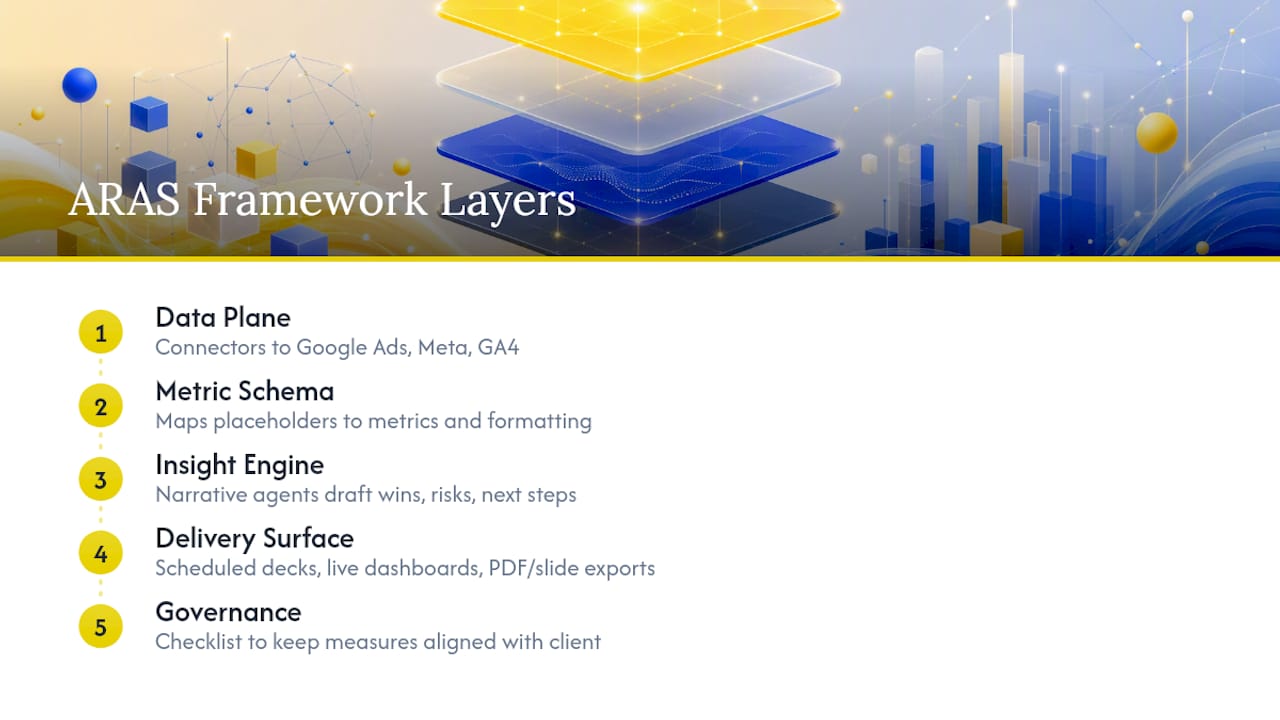
The ARAS framework, short for Agency Reporting Agent Stack, organizes all of this into five layers: Data Plane, Metric Schema, Insight Engine, Delivery Surface, and Governance. It is less a product and more a checklist for making sure automation does not quietly drift away from what the client actually agreed to measure.
How Do You Set Up Connectors and Templates the Right Way?
Get the sequence wrong and you will spend months untangling a metric that means three different things across three client dashboards. Follow this order instead:
- Inventory every client platform. List which ad accounts, CRMs, and analytics tools each client uses, then rank connectors by how many clients they unlock.
- Build a KPI dictionary before touching templates. Lock definitions for cost per lead, ROAS, and funnel stages so “conversion” means the same thing in every report.
- Map template placeholders to API response fields. Decide formatting rules (currency, rounding, date ranges) once, at the schema level, not inside individual slides.
- Isolate credentials per client. Use scoped API tokens or OAuth grants instead of one shared login, so a revoked access token from one client never breaks five others.
- Set an approval gate. Route the first draft to a human reviewer before anything reaches a client, every time, no exceptions during the first few cycles.
Connector auth methods vary by platform. Google Ads and GA4 typically use OAuth 2.0, Meta uses long-lived access tokens tied to a business manager account, and HubSpot and LinkedIn each have their own token refresh cycles. Mapping those quirks early avoids silent data gaps later.
Pro Tip: Build your KPI dictionary in a shared document before you write a single template placeholder. Teams that skip this step almost always end up rebuilding templates twice because a metric definition changed after twenty reports were already live.
How Do You Export Automated Reports into Figma?
Once the data and narrative are locked, the export path depends on your audience. Three routes cover most agency needs:
- Slides to PDF to Figma import, which works when you want editable text and chart layers a designer can still adjust before final delivery.
- PNG or SVG chart exports, ideal for dropping finished visuals directly into a branded Figma template without touching underlying data.
- Direct image embeds into existing Figma components, useful for agencies running the same branded report shell every month.
Design tokens do the heavy lifting for consistency. Set color, type, and spacing tokens once inside Figma, tied to each client’s brand guide, and every automated chart export inherits the same look without a designer resetting styles each cycle. Prioritized recommendations from the insight engine translate well into design-native components too. A “top three fixes” callout box, built once as a Figma component, can pull fresh text from the AI narrative every month while keeping its visual shape identical.
Executive audiences generally respond better to a clean PDF or slide deck they can forward without editing. Design-savvy stakeholders, or teams that want to remix the report themselves, do better with native Figma files where every chart is still an editable object.
How Does Governance Keep AI Reports Accurate?
Automation only earns client trust when the governance layer catches mistakes before a client does. That is the entire point of a schema-locking approach like ARAS’s governance tier, which pairs a locked KPI dictionary with anomaly detection and an audit trail for every delivered report.
A workable governance setup includes:
- A version log that records every change to a metric definition or formula
- Anomaly rules that flag a metric moving outside its normal range before the narrative agent writes about it
- Inline source references tied to every AI-drafted claim, so a reviewer can trace a sentence back to the exact data pull
- Credential isolation and audit logging across every client workspace, not just the largest accounts
On review time: agencies running a governed pipeline report human review dropping to somewhere between 35 and 55 minutes per client, down from hours of manual assembly, once the schema is locked and anomaly rules are tuned.
Narrative agents work best when constrained to fixed sections, wins, risks, next actions, rather than left to write freely. That constraint alone cuts most of the editorial drift agencies worry about when they first consider automation.
When Does Report Automation Actually Pay Back?
The math depends almost entirely on client count. Manual deck assembly averages about 7.5 hours per client per month; template tools cut that to roughly 3.5 hours; agentic automation, including human review, brings it down to around an hour or less.
| Approach | Time per client per month |
|---|---|
| Manual assembly | ~7.5 hours |
| Template-based tools | ~3.5 hours |
| Agentic automation with review | around an hour or less |
Most agencies cross the break-even point somewhere between 12 and 15 active clients, once setup effort (connectors, templates, KPI dictionary) is paid off by the hours saved every month after. Below that count, the setup labor can outweigh the monthly savings, especially for a solo consultant running two or three retainers where a template tool alone might be the more sensible middle step.
What Does a 90-Day Rollout Look Like?
Agencies that try to automate everything at once usually stall by week four. A staged rollout avoids that:
- Weeks 0 to 2: Inventory every client platform and lock your KPI dictionary. No connector work starts until definitions are final.
- Weeks 3 to 6: Wire connectors one platform at a time, validating each data pull against a manually pulled report before trusting it.
- Weeks 7 to 10: Map templates, design AI narrative prompts for the insight engine, and set anomaly and approval gates.
- Weeks 11 to 12: Run a pilot with three to five clients, measure review time against your baseline, and adjust before rolling out to the full roster.
A pilot that wires APIs across a client roster and uses template-driven population can produce first draft decks for dozens of clients in under an hour, turning the real bottleneck into human review minutes per deck rather than assembly hours. One documented case put 22 first-draft decks together in 48 minutes, with roughly 16.5 hours of combined human review time across all 22, a fraction of what manual assembly for that many clients would cost.
Pro Tip: Run your pilot on your most patient client first, not your biggest one. You want room to catch formatting bugs without a nervous account manager watching every export.
Best Practices for Designing Clear, Persuasive Report Visuals
A report that gets skimmed instead of read usually has one problem: too many numbers competing for attention. Design a visual hierarchy where one metric per section gets the largest visual weight, typically the one tied to the client’s stated goal that month, whether that is cost per lead or return on ad spend.
Color should carry meaning, not decoration. Reserve one color exclusively for “needs attention” flags so a client’s eye jumps there first, and keep the rest of the palette tied to brand tokens rather than default chart colors. Charts with more than five data series almost always read as noise. Break dense comparisons into two smaller charts instead of forcing one crowded one.
White space earns its keep here too. A dense report with six charts per page reads as a data dump; the same six charts spread across three pages with breathing room reads as a story. Persuasive reporting also means pairing every chart with a one-line takeaway drawn from the AI narrative rather than leaving a client to interpret a graph unassisted.
Typography discipline matters more than most teams expect. Stick to two font weights, one for headlines and one for body commentary, so a report does not visually compete with the brand identity it is supposed to represent.
Step-by-Step: Building a Report from Raw Data to Final Layout
Start with the export, not the design. Pull the automated deck or PDF from your reporting pipeline first, since that draft already contains the narrative structure, the prioritized fixes, and the core charts in roughly the right order.
From there, the workflow breaks into four stages:
- Import the raw export. Bring in PNG or SVG chart assets, or the full slide export, and place them against your locked design tokens so brand colors and type apply automatically.
- Rebuild any chart that needs interactivity. Static exports are fine for most metrics, but a chart a client is likely to ask questions about benefits from being rebuilt as an editable, native component.
- Slot in the prioritized recommendations. Turn the AI-generated “top three fixes” list into a dedicated component, since that section usually drives the actual client conversation more than any chart does.
- Run a branding pass last. Check logo placement, color accuracy against the client’s brand guide, and consistent spacing across every page before export.
This order matters because designers who start with layout before data ends up rebuilding charts twice, once for the initial mockup and again when real numbers replace placeholder data. Pulling the real export first removes that redundant step entirely. Agencies using a unified dashboard approach for pulling metrics into one connected view tend to find this stage faster, since every chart already reflects the same underlying numbers instead of five disconnected exports.
How Do Teams Collaborate on Reports Before Delivery?
Comment threads tied directly to a specific chart or paragraph beat a separate feedback email every time. When a stakeholder can leave a note on the exact metric they are questioning, the reviewer knows precisely what to check instead of guessing which number triggered the concern.

Version history matters just as much for reports as it does for any other design file. Keeping every draft as a distinct version lets a reviewer roll back a change that turned out to be wrong, rather than trying to reconstruct what the report looked like before an edit. For agencies running multiple approval rounds, that history becomes the de facto audit trail for what changed and why.
Real-time co-editing changes the review dynamic too. An account manager and a designer working the same file simultaneously catch formatting and framing issues faster than a back-and-forth review chain, especially under a monthly deadline where every round trip costs a day.
A few practical habits make this smoother:
- Assign one owner per report who resolves comment threads, so feedback does not pile up unaddressed across three reviewers.
- Set a hard cutoff for stakeholder comments, typically 48 hours before delivery, so last-minute edits do not derail the schedule.
- Tag comments by type (data question, design note, narrative edit) so a reviewer can triage quickly instead of reading every thread top to bottom.
Teams that skip a defined comment workflow tend to end up with feedback scattered across Slack, email, and the file itself, which is exactly the kind of fragmentation automated reporting is supposed to eliminate in the first place.
How Do You Keep Branding Consistent Across Every Report?
Branding drift happens quietly. One report uses the client’s primary blue, the next uses a slightly different shade because someone eyeballed it instead of pulling the hex code, and by month six the reports look like they came from different agencies.
Design tokens solve most of this at the source. Lock color, typography, and spacing values once per client, tied to their actual brand guide, and every new report inherits those values automatically rather than depending on a designer’s memory. A locked component library does the same job for structural elements: header layout, footer disclaimers, chart legends. Build those once, reuse them every cycle, and resist the urge to “improve” them mid-quarter without a documented reason.
Naming conventions inside your design file matter more than they seem to. A component library where every client’s assets share the same naming pattern, “ClientName / Header / Primary,” for instance, makes it far easier to spot when someone accidentally applied the wrong client’s colors to a shared template.
Audit consistency on a schedule, not just when something looks wrong. A quick pass every quarter, checking five random reports against the master brand file, catches drift before a client notices it. Clients notice branding inconsistency faster than almost any other report flaw, since it is the one thing they can spot without understanding a single metric.
Finally, treat brand updates as a deliberate rollout, not a quiet edit. When a client refreshes their logo or color palette, update the token file once and let every future report inherit the change, rather than manually patching old templates one at a time.
What Goes Wrong When You Connect Data Sources to Design Files?
The most common failure is a broken connector nobody notices until a client asks why last month’s numbers look identical to this month’s. Set an automated check that flags when a data pull returns the exact same values as the prior period, since that almost always means a token expired or an API call silently failed rather than a genuinely flat month.
Formatting mismatches cause the second most common headache. A currency field pulled as a raw number without a decimal or symbol looks like a typo to a client, even when the underlying data is correct. Lock formatting rules at the template level, not per report, so a designer never has to remember to reformat a number by hand.
Token expiration quietly breaks more pipelines than any other issue. Meta and Google Ads tokens expire on different cycles, and a shared login instead of scoped, per-client credentials makes it nearly impossible to tell which client’s connection just failed. Isolating credentials per client, as covered in the setup checklist above, turns a mystery outage into a two-minute fix.
Watch for metric definition drift too. If “leads” means form fills in one connector and form fills plus phone calls in another, a report can show a swing that has nothing to do with actual performance. A locked KPI dictionary prevents this, but only if every new connector gets checked against it before going live, not after a client flags a confusing number.
Finally, do not skip a raw-data sanity check before the first automated export reaches a client. Compare the automated pull against a manual export for one full cycle. It costs an extra hour and catches nearly every connector issue before it becomes an awkward client email.
Treat Reporting as Infrastructure, Not a Repetitive Task
Most agencies still treat reporting as a monthly chore that eats a Friday. That framing is backward. Reporting is infrastructure, and infrastructure either scales with you or quietly caps your growth.
The real payoff isn’t the hours saved, it’s what senior staff do with them. Move a strategist from deck assembly to actual client strategy, and retention improves because the conversation shifts from “here are your numbers” to “here’s what we’re doing next.” Roll automation out gradually, client by client, rather than flipping every account over at once. That staged approach catches schema mistakes while the stakes are still low.
None of this means AI gets the final word. Every external claim in a report still needs a human who checked it before a client sees it. Automation drafts. People decide what actually goes out the door.
— Ovannes
Get Figma-Ready Client Reports Running with Gleanit
Some tools build this exact pipeline instead of asking your team to stitch one together from multiple separate tools. They monitor ad performance and customer journeys across major platforms, flag where a client’s funnel is leaking value, and rank fixes by ROI instead of dumping every metric into one undifferentiated report.
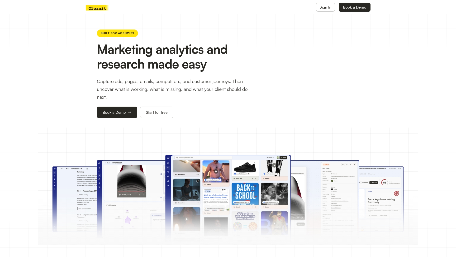
An AI layer can turn that prioritized data into a written narrative, and the output can connect into design workflows agencies use, including Figma, so a report that starts as raw connector data ends as a polished, branded deliverable without a designer starting from a blank canvas. Agencies may see their first automated draft within days of connecting accounts, then spend the following weeks tuning the KPI schema and narrative tone until the report reads like it came from a senior strategist, not a script.
If your team is still assembling decks by hand every month, start a trial with Gleanit and connect your first client account to see what a prioritized, AI-drafted report looks like before your next reporting deadline.
FAQ
What Does “Figma for Marketing Reports” Actually Mean?
It refers to automated marketing analytics and AI-generated client reports that export into Figma-compatible assets, not designing reports manually inside Figma from scratch.
How Much Time Does Report Automation Actually Save?
Manual deck assembly runs about 7.5 hours per client monthly, while a governed agentic pipeline typically brings that down to 35 to 55 minutes of human review per client.
Which Connectors Should an Agency Prioritize First?
Start with whichever platforms cover the most clients, usually Google Ads, Meta, and GA4, then add LinkedIn, TikTok, and HubSpot connectors as client rosters demand them.
Is Report Automation Worth It for a Small Agency?
Most agencies hit break-even somewhere between 12 and 15 active clients; below that, a template tool may make more sense than a full automation setup until the client base grows.
Does Gleanit Support Figma-Ready Report Exports?
Yes. Gleanit automates ad and customer journey monitoring, prioritizes funnel fixes, and generates AI-drafted reports with outputs built to fit into existing design workflows, including Figma.
Recommended
- Campaign Post Mortem: A Repeatable Agency Template
- Unified Marketing Dashboard: Faster Insights for Agencies
- A Creative Testing Framework That Actually Scales Ad Results
Corrections: ovannes@hearye.co or our editorial policy.